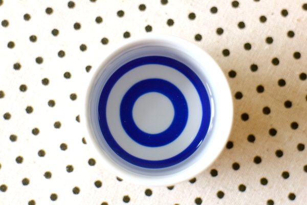
The concentric circles that make up the Taste Translation logo are based on those found inside official sake tasting cups, kiki-choko (ききちょこ). The pattern is called ja-no-me (蛇の目), “snake eyes”.
Professional sake tasters look through the sake at the alternating white and blue background to judge clarity – any cloudiness will show up clearly against the blue background.
So why is the Taste Translation logo red? The colour is called hi-iro (緋色), a shade of crimson that suggests good fortune in Japanese culture.
As they say, kanpai (乾杯)!

Taste Translation logo
